 There are lots of very cool design trends in 2015. I think the rise in smart phone usage, and thus, the demand for mobile friendly design, has given way to a focus on keeping things simple. I have a pretty even split of time I spend on my phone vs time spent on my computer. When I'm searching for something on my phone, my attention span is pretty close to that of a goldfish. If I can't navigate a site; if there is even a second of delay or hesitation due to slow loading time or poor design, I'm gone and off to the next thing. I try to keep this attention deficit in mind when I design mobile-friendly websites for our clients.
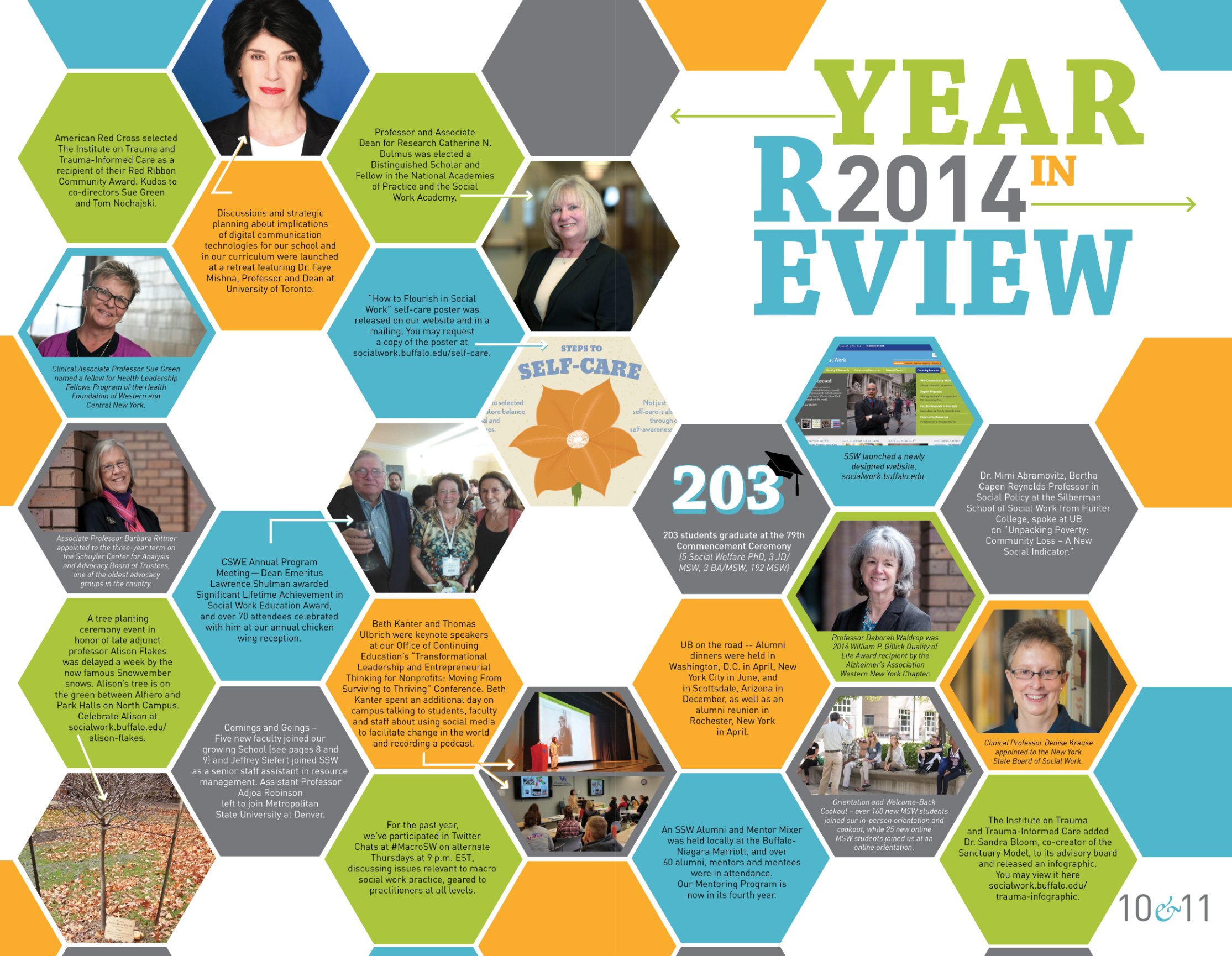
All the best designers are too, which is why some of the cooler mobile inspired web design elements are now finding their way into print design. You've probably seen lots of tech-type patterns like polygons, hexagons, or circuit board style infographics. We used the hexagons ourselves for the University of Buffalo School of Social Work's MOSAICS magazine. The publication featured a spread called "Year in Review". The spread was organized into hexagons with an emphasis on simplicity. We arranged the stories to maximize readability and flow. The layout reads from the upper left section across to the lower right. I'm a huge fan of this spread because of its trendiness, but also because of the beautiful typography in the headline. Typography is a timeless skill that never goes out of vogue, though the fonts we use might pass in and out of style.
The New York Times Magazine had a beautiful example of a layout that I would consider very tech in style in their June 28, 2015 edition. The publication featured a table of contents that was laid out like the structure of a molecule. Each story is organized into a large circle, with dotted lines leading the viewer to smaller circles or snippets of text (subtitles, captions and page numbers). The page has a lot of negative space, a trend that Apple has made popular, and is organized the same way that I would plan the structure of a website.
Along with techy patterns is an onslaught of super simplified iconography design. Icons are wee graphics that convey a subject in a hot second. The apps on your phone are an excellent examples, as each app has a separate icon to help identify it quickly for the user. Its a fascinating sect of graphic design because it relies heavily on archetypes. Any designer that struggled through their Psychology class in college knows what I'm talking about. Archetypes are fundamental, almost instinctual ideologies, or even stereotypes, that we all share. You can make a ton of arguments about archetypes and how they differ between cultures, sexes, etc. But, from a design point of view, a picture of a phone in a circle (even the old handheld landline phone that you would see on a telephone booth) conveys the message "Here is a phone" to anyone, regardless of sex, upbringing or environment (to a certain extent). I think the interpretations of iconography are modernizing, and because of the limited real estate on a smart phone screen, icons have never been more useful. You'll see a lot of great interpretations and sweet graphic elements like 3D renderings, graphic illustrations, and, my favorite, long shadows to create dimension on a simple drawing. The message is still the same, but the rendering is getting a futuristic makeover.
What are some of your favorite design trends happening right now? Tell me about your favorite icons, publications and neighborhood designs in the comments below.
Savannah
Graphic/Web Designer at Onion Studio.

0 Comments